CASE STUDY — FULL EVIDENCE
Jeep Digital Experience & Design System
Helping customers confidently explore, customize, and service their vehicles through a simpler, more human digital experience.
ROLE
UX Lead & UX Researcher
SCOPE
End-to-end
METHODS
Interviews · Surveys · Usability Testing · Card Sorting · Benchmarking
TIMELINE
Week 1–24
Applied Principle: Complexity deserves clarity.
AT A GLANCE
THE PROBLEM
Jeep's digital experience was fragmented — vehicle configuration, service booking, and product exploration lived in disconnected flows with inconsistent UI patterns across markets.
WHAT I DID
Led qualitative research with Jeep owners and prospects, identified the key friction points in the configuration journey, redesigned the core flows, and built a scalable design system to ensure consistency across touchpoints.
MY ROLE
Lead UX Researcher & Product Designer — end-to-end, from discovery to design system delivery.
THE RESULT
A research-grounded design system and redesigned configuration experience that simplified decision-making and established a shared visual and interaction language across the product.
THE CONTEXT
When digital and physical experiences drift apart.
Jeep represents a brand built on rugged capability and human connection. However, its digital ecosystem had become fragmented and technically overwhelming—creating a significant gap between the freedom of the road and the frustration of the screen. The existing platform was built for legacy systems rather than user intuition.
THE CHALLENGE
The challenge.
How might we design a unified, global Design System that scales across Jeep’s entire digital portfolio while remaining true to its heritage? Our goal was to simplify complex purchase and service funnels, reduce cognitive load for customers, and build a digital identity that feels as premium and capable as the vehicles themselves.
MY ROLE
What I was responsible for.
Defining the research plan, objectives, and timeline
Running usability testing and card sorting sessions
Conducting user interviews and surveys
Defining design principles before touching any wireframe
Synthesizing findings into actionable insights
Redesigning the information architecture and navigation
Designing the final UI, including the vehicle x-ray interaction concept
DISCOVERY
Research objectives & methodology.
Five objectives, five methods — mapped to show which method answered which question.
OBJECTIVE ↓ / METHOD →
Understand how users research and purchase vehicles online
01
Identify pain points in model comparison, financing tools, and booking flows
02
Provide actionable insights to improve engagement and conversion
03
Test customization features and vehicle comparisons
04
Evaluate overall usability and engagement
05
User Interviews
n = 12
Surveys
n = 50
Usability Testing
n = 8
Maze/FigJam
Card Sorting
Benchmarking
3 brands
Directly addressed by this method
Not a primary source for this objective
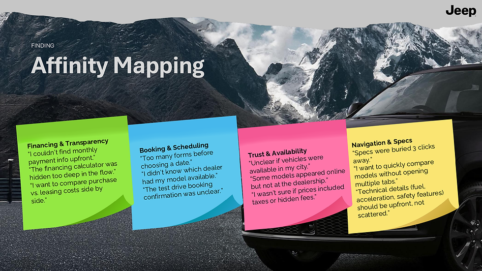
KEY FINDINGS
What the research revealed.
01
Navigation hesitation
Users hesitated before selecting a vehicle model. The navigation structure created decision anxiety at the very first step.
02
Vehicle characteristics clarity
Most participants wanted more context about acceleration and fuel data. Specs existed but weren't surfaced at the right moment.
03
Customization discoverability
Most participants easily changed vehicle color but struggled to notice rim and accessory options. The hierarchy within the customization flow was broken.
04
Specifications overload
The specs section was findable, but the scrolling experience felt overwhelming. Information density without visual hierarchy created fatigue.
05
Accessories engagement
Mixed engagement with accessories — some participants skipped entirely. Accessories lacked context and weren't connected to the purchase decision.
DESIGN PRINCIPLES
The principles that shaped decisions.
Reduce decision anxiety
Make service booking predictable
Minimize cognitive load
Build trust through transparency
Every interaction should help users move forward with confidence, not hesitate.
Users should always know what happens next — no ambiguity, no dead ends.
Less is more. Prioritize the information users actually need at each moment.
Specs, pricing, availability — if users have to guess, we've already lost them.



OUTCOMES
What changed for users.
Navigation
Users moved through vehicle exploration with greater confidence and less hesitation from the very first interaction.
Customization
The new configuration flow made options more discoverable, increasing engagement with vehicle personalization features.
Financing
Integrating the calculator directly into vehicle pages eliminated a critical friction point in the purchase decision journey.
Booking
Reducing the test drive flow to 3 streamlined steps significantly improved completion rates during usability testing.
Trust
Transparent dealer information and clearer pricing signals improved user confidence throughout the experience.
REFLECTION
What this project taught me.
The biggest lesson from this project wasn't about design technique. It was about the relationship between information and confidence.
Users weren't struggling because the platform lacked content — it had plenty. They were struggling because that content was organized in a way that created friction instead of clarity. Every decision in this project came back to one question: does this help the user take the next step with confidence? That question, I've learned, is worth asking before every design decision.